
Chapter 3: JSX & Core Components
In this chapter, we move from basic JSX concepts to building our first real screen in ExpenseApp:
👉 Add Transaction Screen (Description + Amount in INR)
We will gradually enhance the same UI while learning:
- JSX fundamentals
- Core React Native components
- Component hierarchy
- Parent-child component relationships
- Styling approaches:
- Inline Styling
- Internal StyleSheet
- External Shared StyleSheet
This chapter establishes the foundation of React Native UI development and prepares us for building scalable mobile application screens.
🎯 What You Will Learn
By the end of this chapter, you will:
- Understand JSX syntax and structure
- Learn React Native core components
- Understand parent-child component hierarchy
- Capture user input using
TextInput - Apply styling using multiple approaches
- Build reusable and maintainable UI
- Organize shared styles properly
⚛️ Understanding JSX
JSX (JavaScript XML) allows developers to write UI using syntax similar to HTML.
It makes UI code easier to read and organize.
Example:
<Text>Hello React Native</Text>
Although JSX looks similar to HTML, React Native does NOT use HTML elements like:
<div>
  <p>
    <button></button>
  </p>
</div>
Instead, React Native provides its own native mobile components.
🧱 React Native Core Components
React Native applications are built using reusable UI components.
These components are nested together to create complete mobile screens.
🔹 Common Components
| Web | React Native | Purpose |
|---|---|---|
div |
View |
Layout container |
p / span |
Text |
Display text |
input |
TextInput |
User input |
button |
Pressable |
Button interaction |
img |
Image |
Display image/logo |
🔹 Important JSX Rules
- Wrap UI inside a single parent component
- Use React Native components instead of HTML tags
- Components can contain other components
- JSX combines JavaScript and UI together
🔹 Components Used in ExpenseApp
We will use the following components to build our Add Transaction screen:
- View → Layout container
- Text → Titles and labels
- TextInput → User input
- Image → Logo/icon
- Pressable → Button interaction
Before using the Image component, copy required images into:
assets/images
🏗️ Understanding Component Hierarchy
React Native applications are built using nested parent-child components.
Each screen contains multiple reusable UI components arranged in a hierarchy.
For example, our Add Transaction Screen contains:
- Parent container views
- Child text components
- Input components
- Button components
- Image components
This nested structure is one of the most important concepts in React Native application development.
📱 React Native Component Hierarchy Diagram
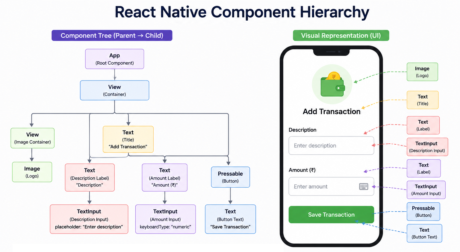
🔄 JSX Component Flow
App Component
    ↓
Container View
    ↓
UI Components
    ↓
Child Components
👨👩👧 Parent vs Child Components
In React Native:
- Parent components contain other components
- Child components are nested inside parent components
Example:
<View>
  <Text>Add Transaction</Text>
</View>
Here:
Viewis the parent componentTextis the child component
⚡ Why Component Hierarchy Matters
Understanding component hierarchy helps developers:
- Organize UI properly
- Create reusable components
- Build scalable applications
- Improve readability
- Maintain applications easily
This concept becomes extremely important in large real-world applications.
💡 Real-world ExpenseApp Example
Our Add Transaction screen contains:
- A parent container (
View) - Child UI components (
Text,TextInput,Pressable) - Nested layouts for image and form organization
This same architecture is used in most professional React Native applications.
🧪 Step 1: Create Basic Transaction UI
Start by creating with a Title first.
import React from "react";

import { Image, Text, View } from "react-native";

export default function App() {
  return (
    <View>
      <Text>Add Transaction</Text>
    </View>
  );
}
✅ At This Stage
- JSX structure is ready
- Components are nested properly
- UI is functional but not visually styled
🎨 Introduction to Styling in React Native
React Native uses JavaScript objects for styling instead of traditional CSS files.
Styles can be applied using:
- Inline Styling
- Internal
StyleSheet - External Shared
StyleSheet
Proper styling helps developers:
- Build responsive layouts
- Improve UI readability
- Create reusable design systems
- Maintain consistent application themes
📋 Common React Native Style Properties
| Property | Purpose | Example |
|---|---|---|
flex |
Controls layout size and screen occupation | flex: 1 |
padding |
Adds internal spacing | padding: 20 |
marginBottom |
Adds spacing below component | marginBottom: 20 |
alignItems |
Aligns child components horizontally | alignItems: "center" |
justifyContent |
Aligns child components vertically | justifyContent: "center" |
fontSize |
Controls text size | fontSize: 24 |
fontWeight |
Controls text boldness | fontWeight: "bold" |
textAlign |
Aligns text horizontally | textAlign: "center" |
borderWidth |
Adds border thickness | borderWidth: 1 |
backgroundColor |
Sets background color | backgroundColor: "#28a745" |
color |
Sets text color | color: "#fff" |
width |
Sets component width | width: 80 |
height |
Sets component height | height: 80 |
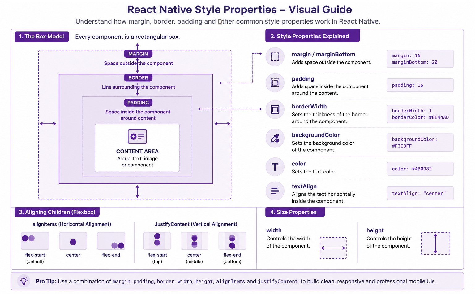
💡 Understanding Important Layout Properties
flex
flex: 1;
Makes the component occupy available screen space.
Commonly used for main container layouts.
padding
padding: 20;
Adds internal spacing inside the component.
marginBottom
marginBottom: 20;
Adds spacing below a component.
Useful for creating gaps between UI elements.
alignItems
alignItems: "center";
Aligns child components horizontally.
🎨 Step 2: Apply Inline Styling
Now improve the layout using inline styles.
import React from "react";

import { Image, Text, View } from "react-native";

export default function App() {
  return (
    <View style={{ flex: 1, padding: 20 }}>
      <Text style={{ fontSize: 24, fontWeight: "bold" }}>Add Transaction</Text>
    </View>
  );
}
✅ Limitations of Inline Styling
Although inline styling works well for small examples, it has limitations:
- Styles become repetitive
- Code readability decreases
- Reusability becomes difficult
- Maintenance becomes harder in large applications
This is why React Native provides StyleSheet.
🎨 Step 3: Use Internal (Local) StyleSheet
Now move styles into a local StyleSheet.
Add StyleSheet
Add the following style object at the end of app/index.tsx:
const styles = StyleSheet.create({
  container: {
    flex: 1,
    padding: 20,
  },
  title: {
    fontSize: 24,
    fontWeight: "bold",
  },
});
Apply Internal Styles
After applying internal styling, the full app/index.tsx file becomes:
import React from "react";

import { StyleSheet, Text, View } from "react-native";

export default function App() {
  return (
    <View style={styles.container}>
      <Text style={styles.title}>Add Transaction</Text>
    </View>
  );
}

const styles = StyleSheet.create({
  container: {
    flex: 1,
    padding: 20,
  },
  title: {
    fontSize: 24,
    fontWeight: "bold",
  },
});
✅ Benefits of Internal StyleSheet
- Cleaner code structure
- Better readability
- Reusable styles within the same file
- Easier maintenance
🎨 Step 4: Use External Shared StyleSheet (Recommended)
Now move styles into a reusable shared file.
📁 Create File
src/styles/styles.ts
Add Shared Styles
import { StyleSheet } from "react-native";

export const styles = StyleSheet.create({
  container: {
    flex: 1,
    padding: 20,
  },
  title: {
    fontSize: 24,
    fontWeight: "bold",
  },
});
Import Shared Styles
import { styles } from "../styles/styles";
📁 Final Code (Chapter 3 Output)
import React from "react";

import { Text, View } from "react-native";
import { styles } from "../styles/styles";

export default function App() {
  return (
    <View style={styles.container}>
      <Text style={styles.container}>Add Transaction</Text>
    </View>
  );
}
📱 Platform Components
SafeAreaView
Prevents UI overlap with:
- Mobile notch
- Status bar
- Device edges
StatusBar
Controls status bar appearance.
<StatusBar barStyle="dark-content" />
🚀 Building the Complete Add Transaction Screen
After adding an image, labels and TextInput fields for entering the expense description and amount, along with a Pressable button for submission, the complete screen appears as follows:
📁 Final Code app/index.tsx
import React from "react";
import { Image, Pressable, Text, TextInput, View } from "react-native";
import { styles } from "../styles/styles";

export default function Index() {
  return (
    <View style={styles.container}>
      <View style={styles.imageContainer}>
        <Image
          style={styles.image}
          source={require("../assets/images/expense-logo.png")}
        />
      </View>

      <Text style={styles.title}>Add Transaction</Text>
      <Text style={styles.label}>Description</Text>
      <TextInput style={styles.textInput} placeholder="Enter description" />

      <Text style={styles.label}>Amount</Text>
      <TextInput
        style={styles.textInput}
        placeholder="Enter amount"
        keyboardType="numeric"
      />

      <Pressable style={styles.button}>
        <Text style={styles.buttonText}>Add Transaction</Text>
      </Pressable>
    </View>
  );
}
📁 Final styles src/styles/styles.ts
import { StyleSheet } from "react-native";

export const styles = StyleSheet.create({
  container: {
    flex: 1,
    padding: 20,
  },
  imageContainer: {
    alignItems: "center",
  },
  title: {
    fontSize: 24,
    fontWeight: "bold",
    textAlign: "center",
    marginBottom: 20,
  },
  image: {
    width: 80,
    height: 80,
    marginBottom: 20,
  },
  label: {
    fontSize: 16,
    fontWeight: "600",
    marginBottom: 5,
  },
  textInput: {
    borderWidth: 1,
    borderColor: "#ccc",
    padding: 10,
    borderRadius: 5,
    marginBottom: 20,
  },
  button: {
    backgroundColor: "#007BFF",
    padding: 15,
    borderRadius: 5,
  },
  buttonText: {
    color: "#fff",
    fontSize: 16,
    textAlign: "center",
  },
});
✅ Best Practices
- Use external stylesheets for reusable styling
- Keep components small and focused
- Use meaningful style names
- Organize assets properly
- Avoid excessive inline styling
⚠️ Common Mistakes
- Forgetting to wrap text inside
Text - Using HTML tags instead of React Native components
- Using too many inline styles
- Forgetting to import
StyleSheet - Missing commas inside
StyleSheet.create()
🧪 Practice Exercises
- Add a new
Categoryinput field below Amount - Change button color and text size
- Add subtitle below “Add Transaction”
- Create a second button named “Reset Form”
📘 Chapter Summary
In this chapter, you:
-
Learned JSX fundamentals
-
Understood component hierarchy
-
Learned parent-child component relationships
-
Used React Native core components:
- View
- Text
- TextInput
- Image
- Pressable
-
Learned common styling properties
-
Built a real Transaction UI
-
Applied styling using:
- Inline Styling
- Internal StyleSheet
- External Shared StyleSheet
-
Prepared the UI foundation for upcoming chapters